CASE STUDY
Black + White + Vector
Always start here. A logo should look just as good with color as with out , Color luckily can be added once the initial design has been completed. If possible, make sure to choose a design that does not rely on the color or graphic to be attractive or functional. You may not always be able to reproduce the look initially created when it begins use depending on the materials required.
Starting with a black and white logo will give a more flexible way to be creative with branding while staying consistent. A vector logo, which refers to line art or camera ready art is the style that allows for the reproduction of your logo while staying consistent.
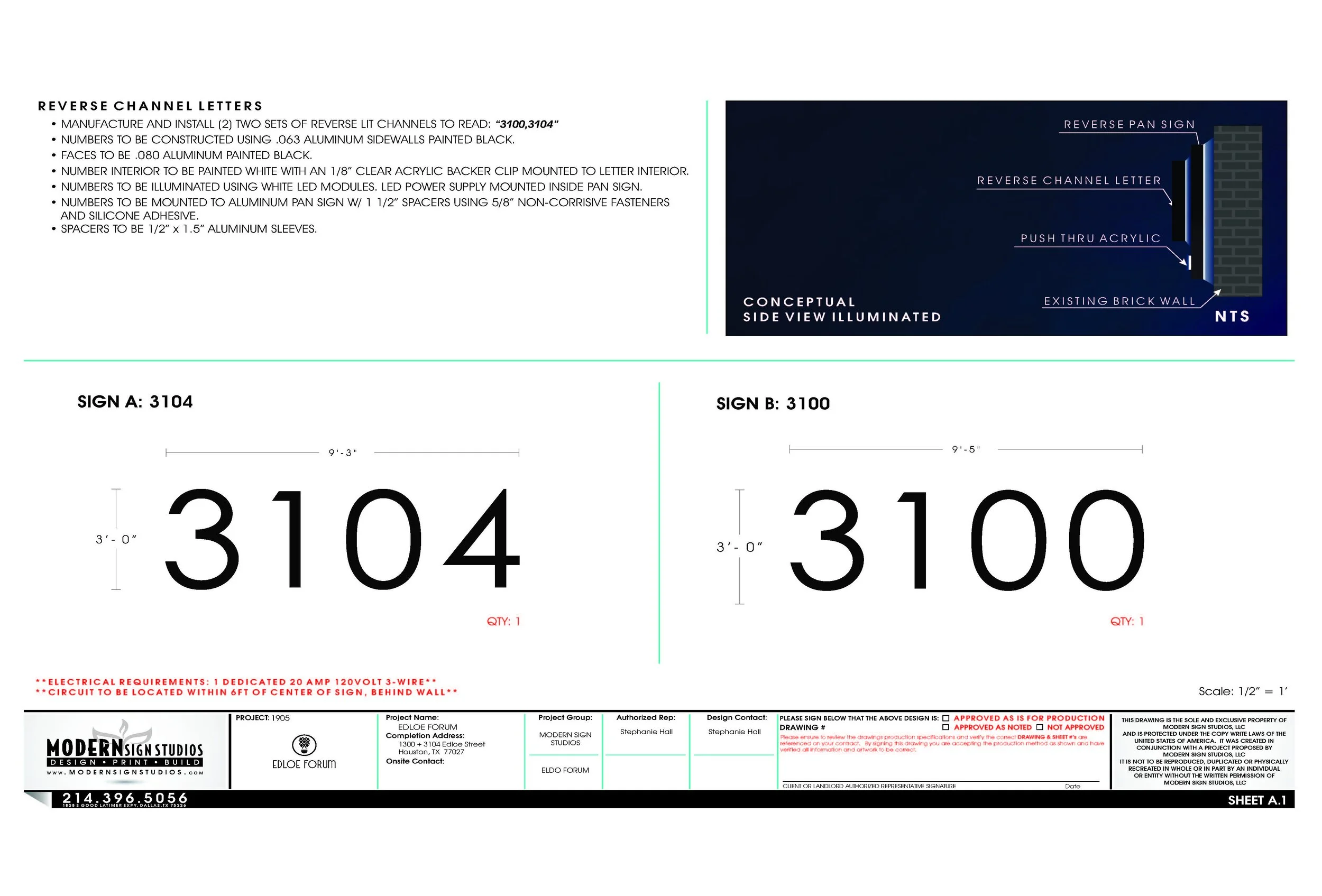
Exterior Signage
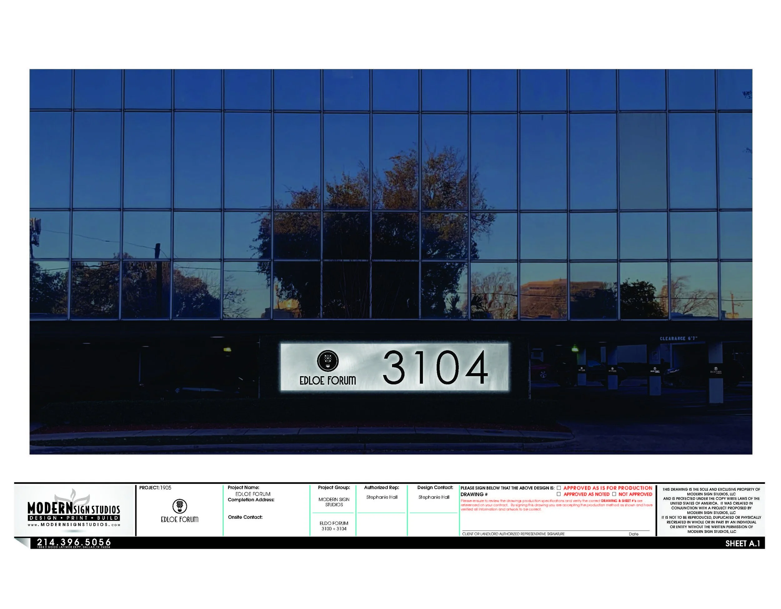
An all aluminum reverse panel sign with aluminum back lit channel letters were chosen by the customer. It was the ideal solution here as it is able to reduce damage caused to the brick building while being secure. It also produces light around the parameter of the sign which adds a lovely shadow creating a classic ambience guaranteed to turn heads.


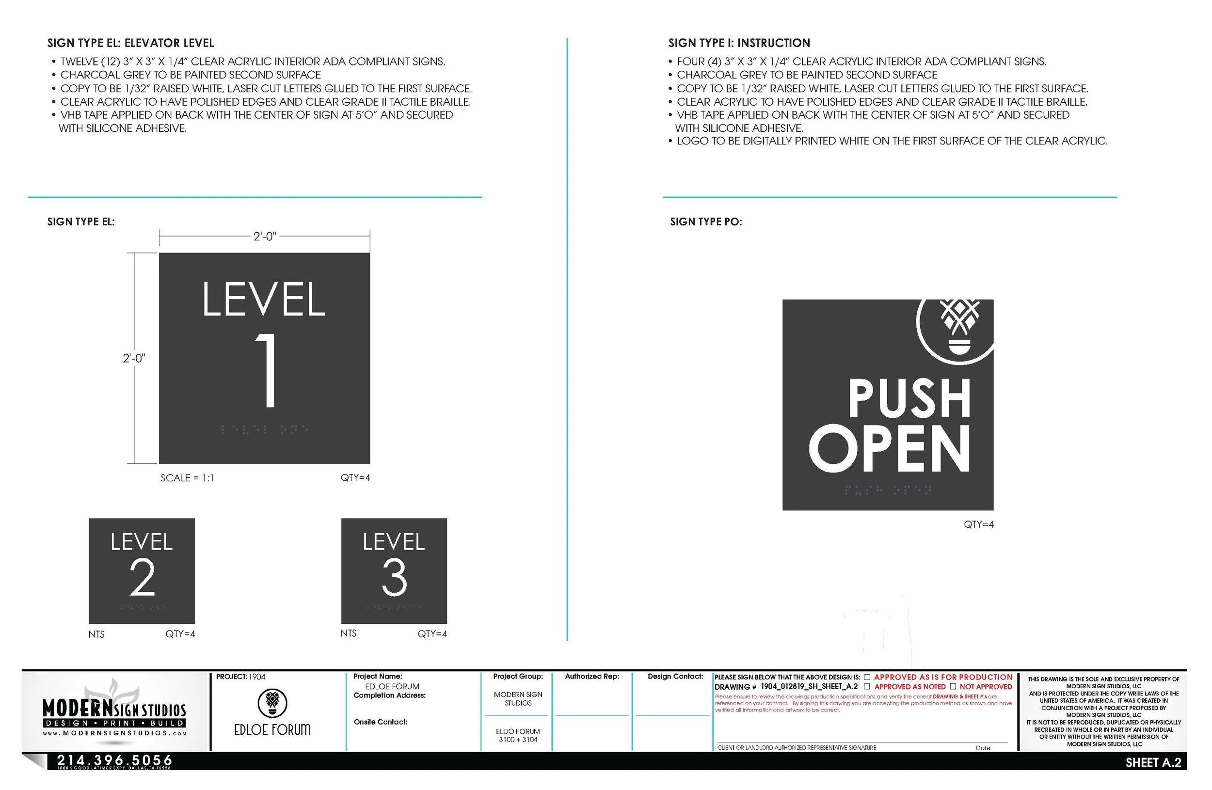
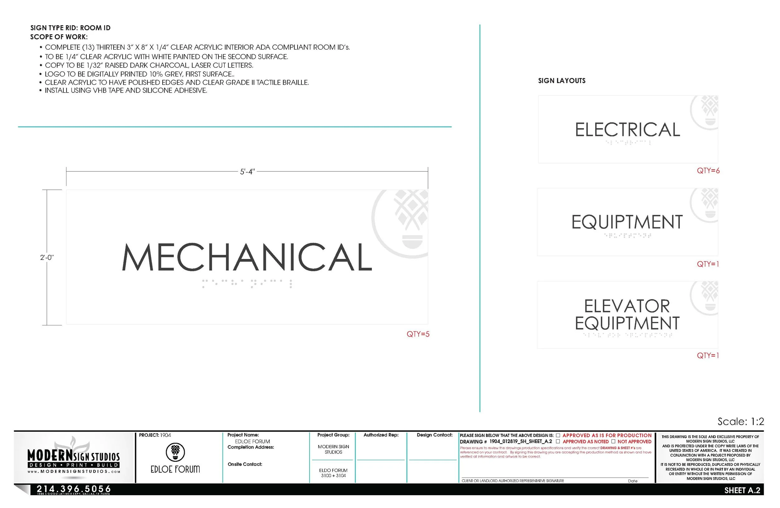
ADA Compliant - Interior Signage
When applicable in the process of designing a sign, the design will be created considering ADA Compliance Regulations. These signs provide directions and information that not only are used in everyday lives but are essential in an emergency.
These signs were created to be attractive as well as direct in the message needing to be conveyed.
SIGN DETAIL PAGE - INTERIOR SIGNAGE